
|
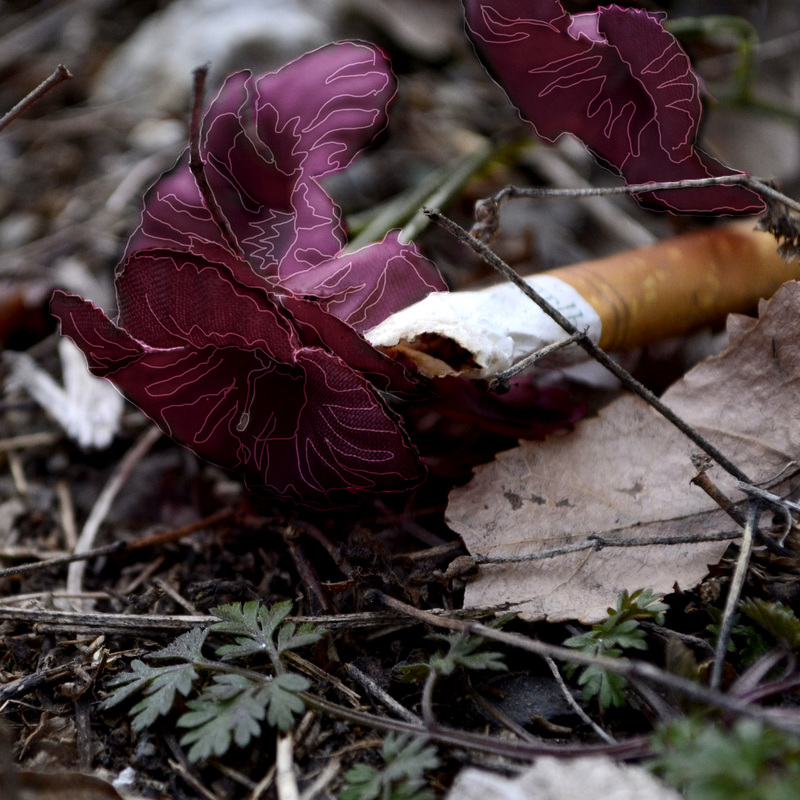
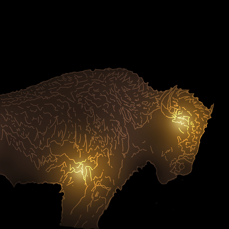
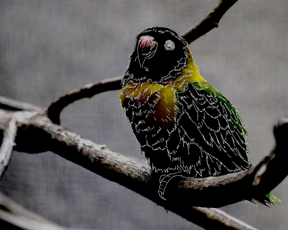
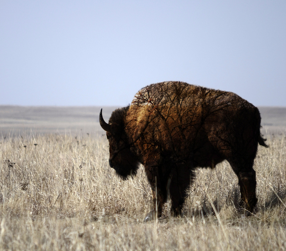
Critique Post: I got a lot of good advice from Emi and Rhona from the last critique. One thing that they said that really stood out to me what that my photos need to have more meaning to them. Right now they are just images with lines drawn over them. I am trying to add a little bit more meaning into the pieces that I am making. A majority of this semester has been working towards trying to figure out what I can do with the line work I have been working with. The first piece that I made for this critique is of a cigarette that I found on the ground laying across some flowers. I manipulated the flowers with the line work and I decided to darken the flowers, so that it looks like the flowers are soaking up the toxins from the cigarette. The second piece goes back to what I was doing with my original Fox image. I simplified the buffalo into lines and then made certain areas glow within the animal. The glowing spots are where the buffalo’s heart and brain are. Something that is a little different in this piece is that I softened the line work. It is not a bright white that stands out and takes a majority of the focal point of the piece. The third piece is using the same line work as the others, but instead of doing the glowing lights or keeping the main subject black, I decided to slowly bring the image back into the piece. I did this by working with the layers in Photoshop and changing the levels. I also tried to give it a darker feel, by darkening the levels and shadows. The original image is much brighter and livelier. Artist Post:
I am doing my artist post over Gretchen Burns. We have been in the art department together for a while now, and it has been so much fun seeing her grow as an artist. We are both in a life drawing class this semester and she has come so far from where she was last semester with drawing figures. I really enjoy the work that she has done with illustrating birds and especially the gif that she made of the bug and the magnifying glass. I can’t wait to see what she has in store for this upcoming critique and next semester! Check out her blog! http://gretchenburns.blogspot.com/
0 Comments
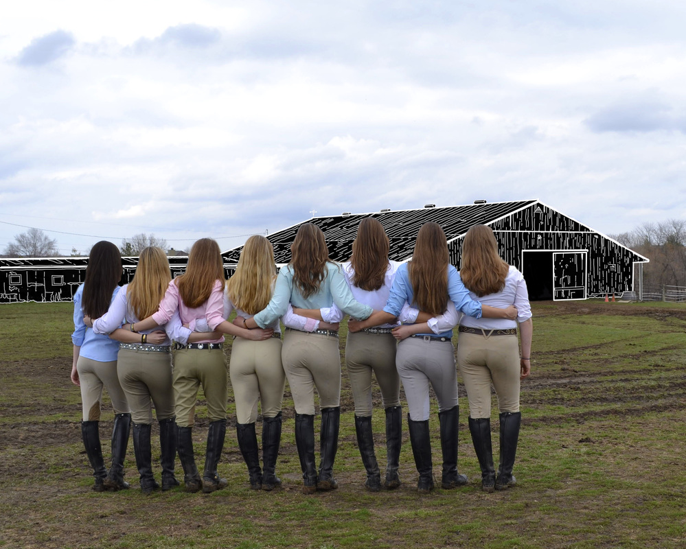 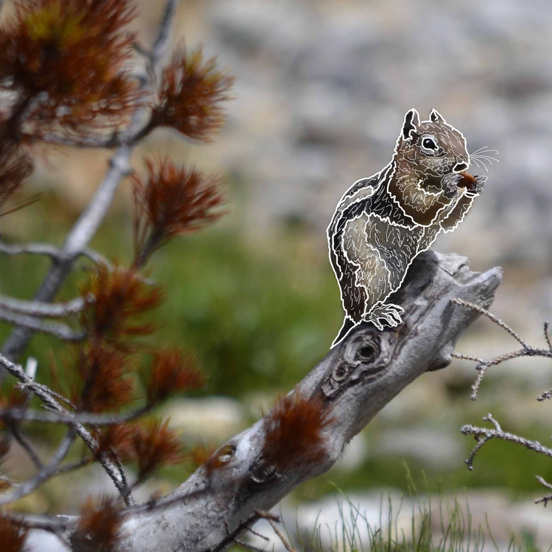 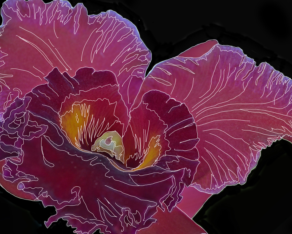 Critique Post: For this critique I am still working with the line technique that I came up with at the beginning of the semester. I feel that I am starting to get the hang of it more now. These pieces are all still work in progresses because I am still working with this technique and seeing where I can take. During the last critique we talked about how I could use the black base with the white line work on top of it, like I did with the hummingbird, as a symbol of death or that something is no longer. While I was creating the hummingbird piece for the last critique I did think of it symbolizing death in some way. I have decided to try and work with this and see what I can create with it. I decided to use an image of my horseback riding team standing in front of our old barn, Hilltop Stables. A majority of us grew up running around this barn and it holds a very special place in each of our hearts. I basically lived at this barn for half of my life and I learned how to ride horses here. The barn was torn down about two years ago, because the land was sold to realtors who wanted to develop it into a strip mall of some sorts. It may sound silly to be so emotionally attached to a piece of land and especially a hole-in-the-wall barn, but it was hard and heartbreaking having to move out of this barn, when I had spent so much time there and basically considered it my home. There is a great sense of loss that is shown with this image, which is why I thought it would be perfect to use for this critique. I am planning on creating more pieces that represent loss or death in my life for the next critique using this style. The other two images that I have for this critique are also using the line work, but I have kept the whole photograph more the most part in the piece. I was really happy with how the flowers turned out for my last critique so I decided to do another one that is similar. I used a thinner line, which I feel adds a little more detail to the image as a whole. I wrestled back and forth with the chipmunk image, because I couldn’t decide it I wanted to show it how it is now or with the chipmunk in black with only the white line-work showing. I decided to keep the image of the chipmunk present, because I like the stylized and the flatness feel that is given off when looking at it. Another reason why did decided not to make the chipmunk black is because the chipmunk is not dead, at least not to my knowledge, so it wouldn’t make much since to make it black when it is still alive. Artist Post:
I am have chosen to write about Sylvia Schultze this time! Through out the semester she has been showing us the progress that she has made on her fruitful forms. I think that is awesome that she is making pieces like these. Pittsburg needs a little enlightenment in this area of the art world. Her pieces are not extremely in your face, but they are still able to get the point across very well. I can’t wait to see them all set up for her senior show. I am also looking forward to seeing how her hands turn out that she is working on that will hold the fruits. Here is her blog: http://sschultze3.wix.com/sylviaschultze
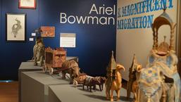
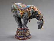
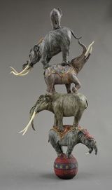 Today I went to Ariel Bowmen’s artist lecture and it was very well done. She talked with so much passion about her work and her artistic career that I hope I can talk about my work with that much passion one day. When I first walked through the gallery and saw her work, I thought that the animals she sculpted were made up and from her own imagination. I never would have thought that all of the animals represented were alive at some point. At one point in her lecture she spoke about why she chose to sculpt prehistoric mammals. Her response was that the prehistoric mammals are not represented very well and that most people don’t know that there are so many different types. I would have never guessed that each elephant in the gallery was alive at some point and that they were each alive at different time periods throughout the Earth’s history.
Her dedication and attention to detail is inspirational and I am very envious of it. She puts so much of herself into her work and it is clearly visible to anyone who looks at it. I am happy that I went to her lecture and got to hear her speak, because it makes me appreciate her artwork even more now after knowing the amount of work that she puts into each and every piece that she shows. 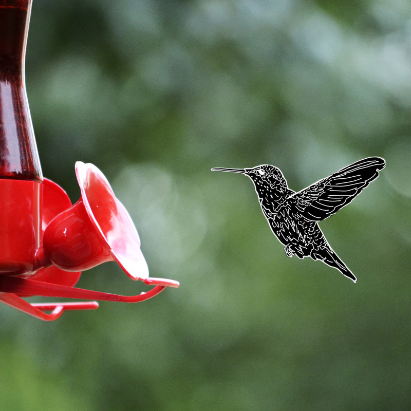 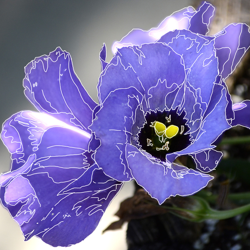 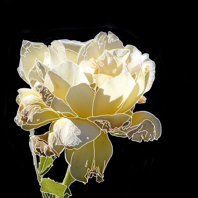 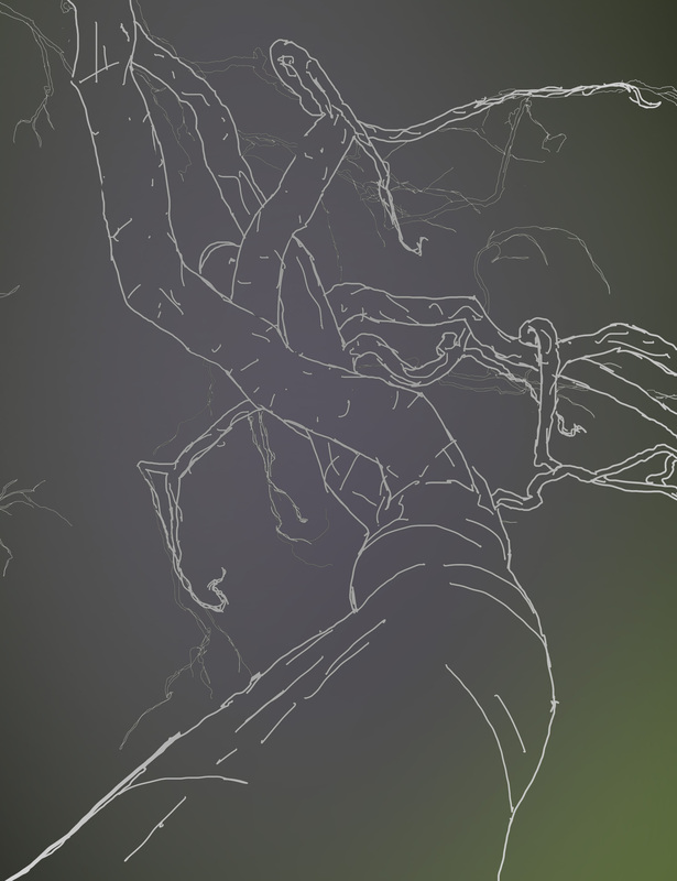 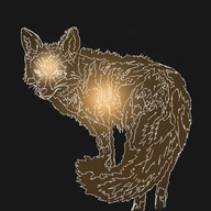 Fox image from Critique 1. Fox image from Critique 1. Critique Post For this critique I am working more on the line work that I had previously done for the first critique in the image with the fox. Josie told me to really try and work on combining the line work with the original image, so that is what I have tried to do. I came up with three different ways of combining the two techniques. The first is the photo with the humming bird. I decided to completely replace the humming bird with the white line work and place it on a black background. I am extremely happy with how it turned out. I am planning on working with other images to get the same look for our next critique. The next two images of the flowers are very similar to each other in the type of style and technique that I used with the line work. With the purple flower I left the background in place, since it wasn’t too distracting to the viewers eye. Have the white line work go over the image of the flower really flattens it out and brings out the shapes of color within the image. The yellow flower I decided to replace the background with solid black, because I wanted the main focus to be on the flower itself. By having the white line work it breaks down the flower into much simpler shapes, yet it still keeps the contrast of the flower petals noticeable. All three of these images are work in progress and I am looking for feedback on how to move forward from this point in my work. The last image that I have is based off of a tree sculpture at the Crystal Bridges Museum in Bentonville, Arkansas. Josie also wanted me to work with the tree a little bit more, just to see what I could do and come up with. I used the same techniques that I did with the fox image from the first critique, but this time I varied some of the line widths to create a little bit of depth to the image. This piece is also a work in progress and I am excited to see where I can go with this type of work. Artist Post
Cat is working on an amazing project this semester and I am very excited to see where it is going to go. She is going to make a series of shadow boxes that will be about her personally life and the emotions that she is dealing with her parents getting a divorce. She has come up with a very clear-cut process on how she will make this piece. There is so much detail and work that has already been put into this piece and I cannot wait to see the finished product at the end of the semester. Link to her blog http://catjepson.blogspot.com/search/label/PSU%20Art%20Practices%20VI%3A%20Studio%20Critique%20III  Critique Post My concepts have not changed since my first blog post. I am still working textures into my photographs. I recently went to the Crystal Bridges Museum of American Art and was intrigued by the stainless steel sculpture of a tree. It is titled Yield and Roxy Paine created it. I took a lot of photos while I was at the museum, many of the tree sculpture and many of textures that I found while walking the trails. 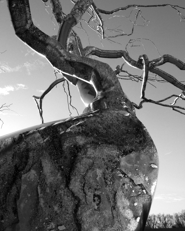 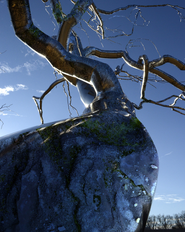 I couldn’t decide if I wanted to show this photo in color or in black and white so I printed both. Both images show something different. The texture is brought out more with the black and white image more; it doesn’t look like it is supposed to be smooth metal. The color image looks more like a reflection of a river in a way and is much smoother looking to the eye.  I am working on a new piece and it is completely digital work within Photoshop. I took an image of a fox that I had taken and simplified it down with lines and colors. I decided to add the glowing areas to show the intelligence of the foxes and their souls. This piece is a work in progress and I am excited to see where it goes after this first critique and other pieces that will be inspired from it. Artist Post I choose to look at Mattie Parrigon’s first blog post. I am very excited to see where her project will take her. She is going to go to a local nursing home and interview the residents that are staying there. She is going to take portraits of them to later make drawings from them. She is also going to incorporate quotes from the interviews into the drawings. A lot of people are trying to copy what Brandon Stanton is doing with his book Humans of New York. Mattie is taking the inspiration she has for Stanton’s work and making it her own. Instead of photographs of random people she meets on the streets, she is taking a group of people that have something in common and drawing portraits of them and getting their back-story. I can’t wait to see the progression of this project through out the semester and the final outcome of it all! Here is her Blog: http://mattieparrigon.blogspot.com/2015/01/writer-blog-posts1.html ID Series
I saw two different presentations at the ID Series. Harriet Bachner and Melinda Ledlow did the first presentation that I saw; it was titled “Complex Trauma and Healing through Drama and Art: Facing the Tiger and Winning.” I found it very interesting when they talked about the many different programs that are starting up around the country to help those dealing with trauma. These programs have the individuals that are dealing with trauma to act out their feelings on a stage. Jessica Stallings and Gaelynn P. Wolf Bordonano did the second presentation that I saw; it was titled, “Art as Healing: Art Therapy in Action in Kansas and Around the World.” I found this talk to be very interesting. I never knew that Emporia State University was one of the best schools to study art therapy at. I also loved seeing the work that was done by some of the patients of the two women who spoke. Hello! My name is Molly McVey and I am a junior at Pittsburg State. I am a 2-D General Arts major with a minor in Photography. My work is about connections being made and relationships that are happening within a photograph. I tend to combine images together to create a final piece. I will take a texture that I have photographed and incorporate it into another one of my images. I place textures into areas that they wouldn’t normally be found; the reason that I do this is to have a subtle change that catches the viewers’ eye. I am starting to experiment with a Wacom tablet that I’m using in Photoshop. I am using the tablet to draw and sketch out different images that I have taken. I’m simplifying the photographs down to lines and blocks of colors. They are all work-in progresses right now, but I am looking forward to see what I can create with it. One of the main artists that I draw inspiration from is Erik Johansson. He is a retoucher and photographer from Sweden. Here is a link to his website: http://erikjohanssonphoto.com I have put some of my work from last springs critique class below.
|
Archives
April 2015
Categories |
 RSS Feed
