
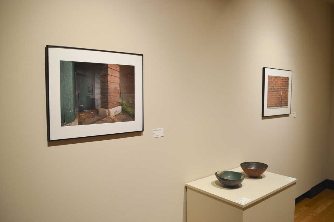
Gwen Walstrand and Sarah PerkinsIt was interesting to see two artists do the presentation together and how they connected their work with each others. A majority of the artist talks that I have seen while I have been at Pitt, besides the senior talks, have normally been done by only one artist. It was interesting to see how they did their talk, since they did a group show and the senior group show was coming up soon.
I feel like their presentations were pretty professional, they used power points to show off their work. There wasn't any text on the slides, they were just pictures of their work, which I found to be more professional. They both showed work that was outside of the show that is up in the gallery., which I liked. It made their presentation more personal, to see what else they have done with their art. What I took away from the talks and the exhibition itself, was that you can take two completely different types of art and create one unified show with them.
0 Comments
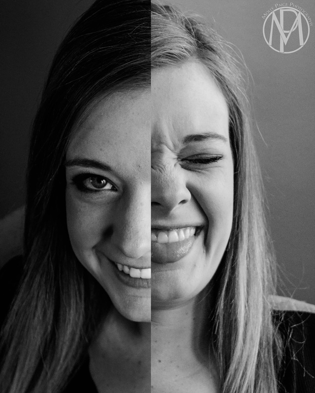
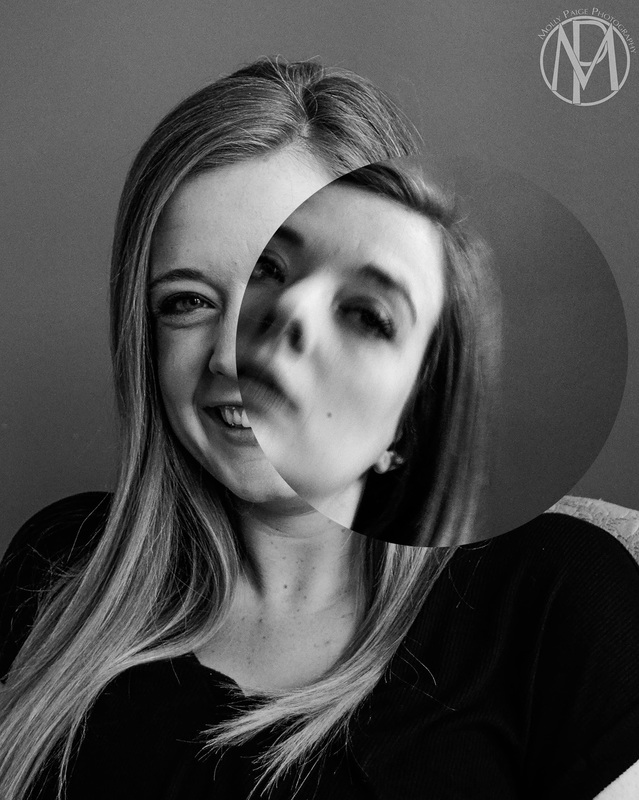
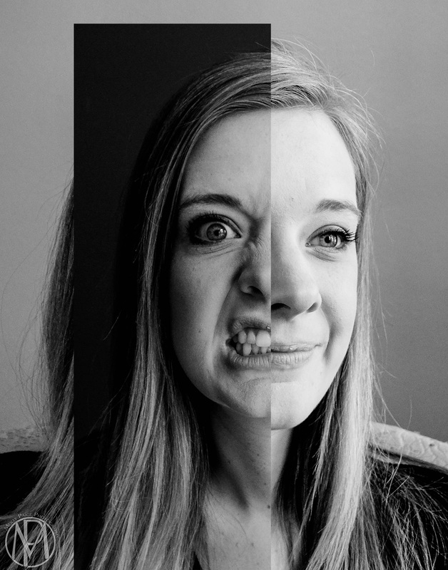
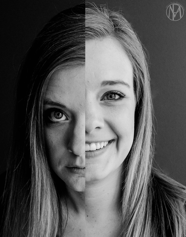
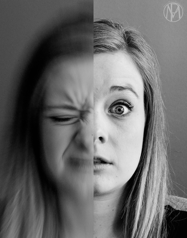
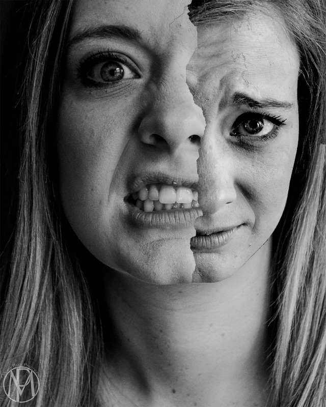
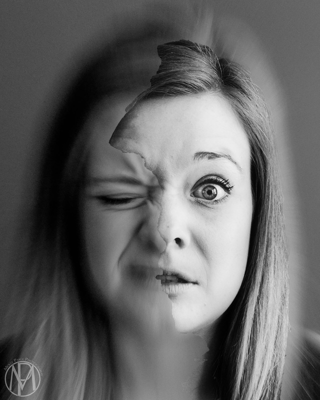
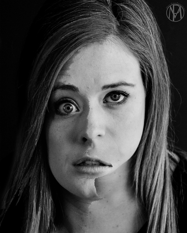
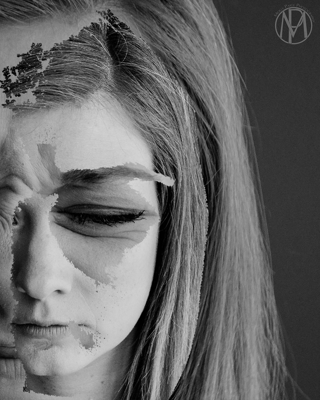
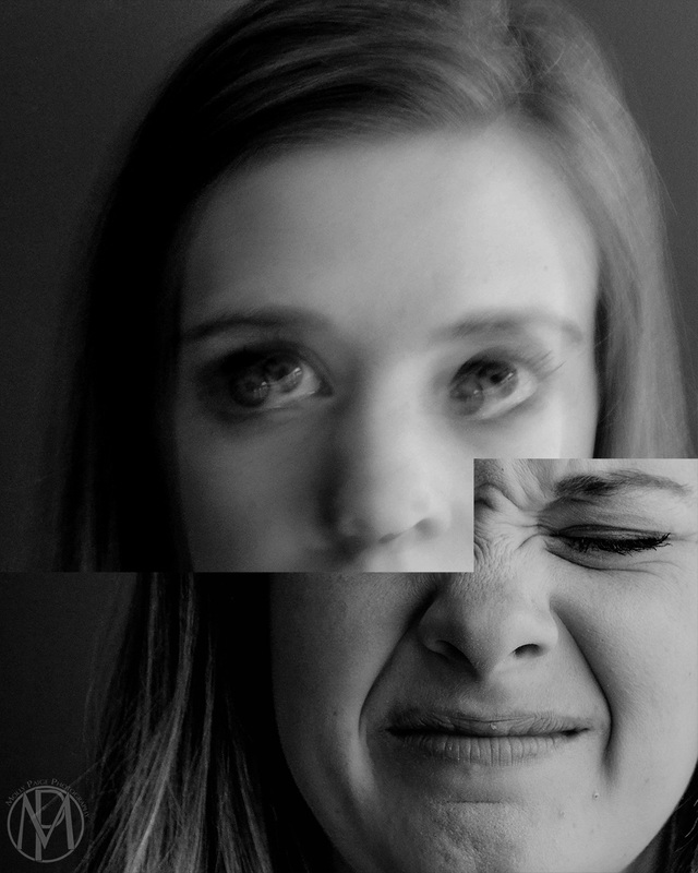
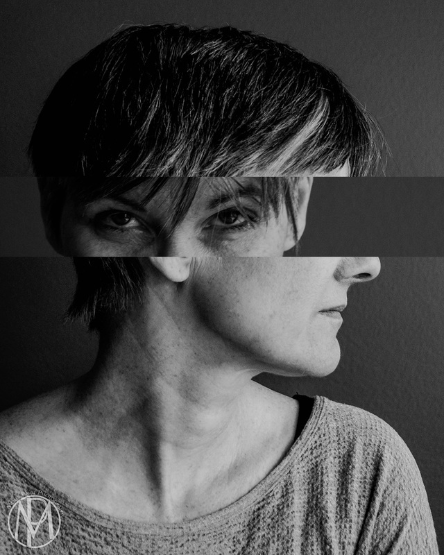
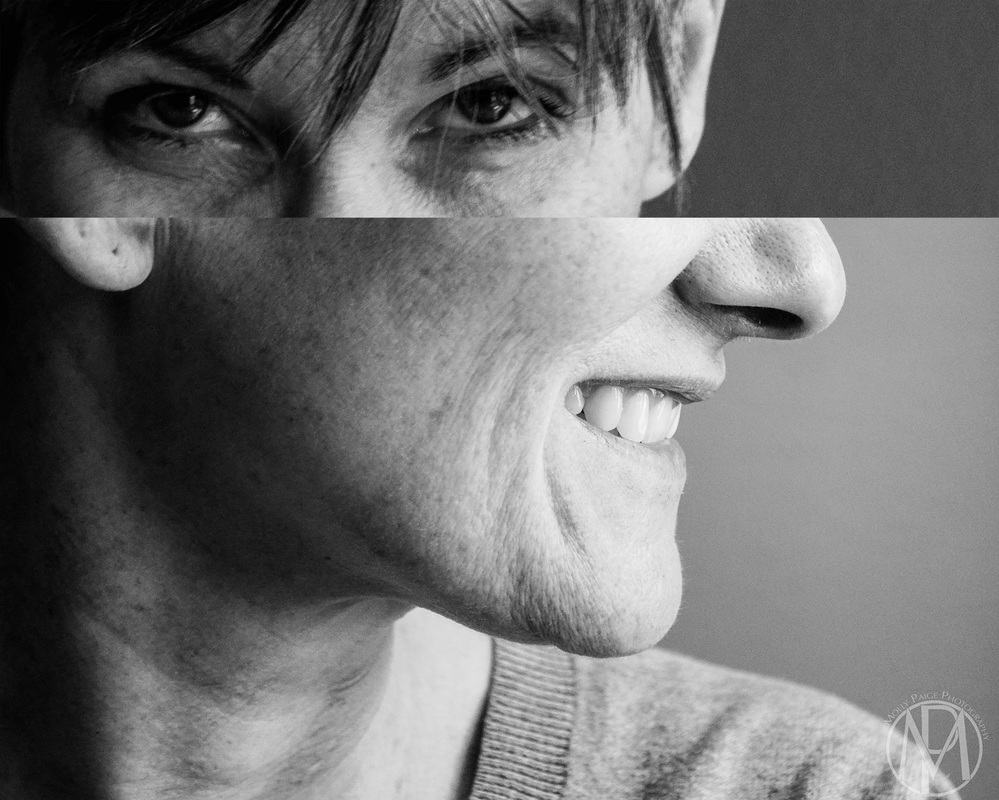
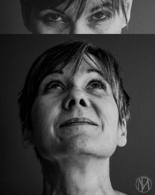
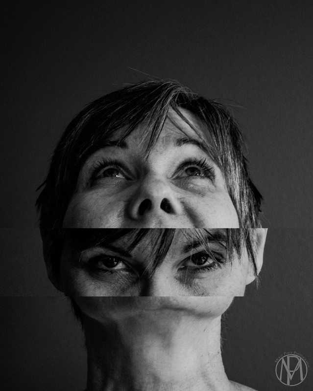
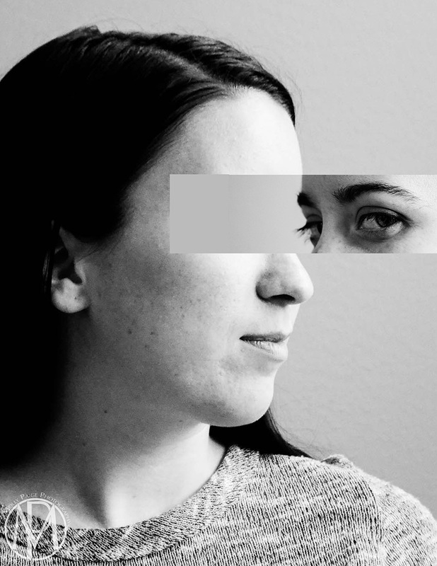
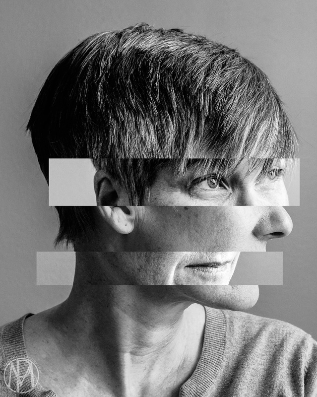
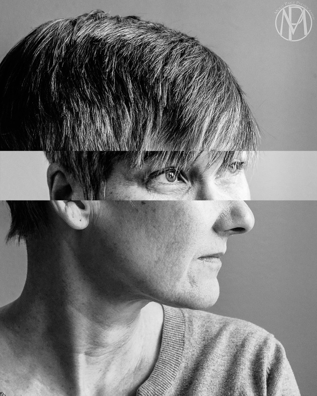
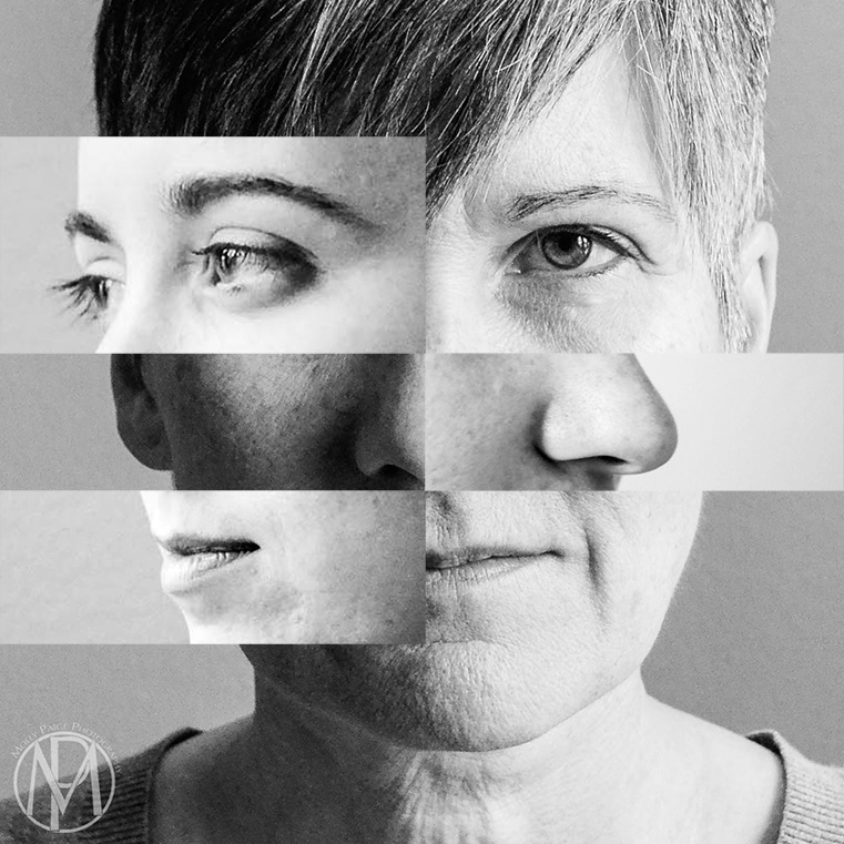
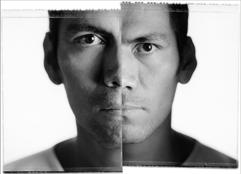
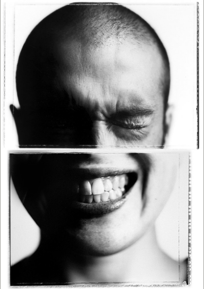
Since the last critique I have continued to work with the idea of the two contrasting emotions within one image. In the last critique I experimented with my process of combining the images together. For this critique I have gone back to my original way of piecing the images together. Before I was combining the images in an organic type of way, where now I am back to placing rectangles and squares on the images. I am also splitting the image down the middle more, because I feel that it gets the emotions across to the viewer more clearly. This can be seen in, FACE #1, #2, and #3. In FACE #4, I tried something a little different, I decided to try using a circle instead of rectangles or squares to combine the images together. It gave an interesting effect on how the two different emotions are portrayed. It seems to only work with certain images and it takes a long time to figure out which image it works with the best, which is why I only have one image that uses the circle. I am planning on experimenting more with this process to see what else I can create with these images. I am still working with them and finding different ways that I can piece them together, which is why I do not have a final series yet. There is a lot more that I can do with the images, and I am planning on figuring those things out the more I work with the images I have taken. Artist Post: Jacqueline DentonThis semester Jacque has been working large scale with her drawings/paintings and I think this is awesome! It is something new for her to work on and adds in a whole new set of challenges. I feel that every artist should work large scale and small scale at some point in their artistic career. Jacque's large scale paintings effect the viewer in a whole new way now. The pieces are more in the viewers face and confrontational, where they weren't as much before, when they were smaller. I think that Jacque should continue to work large scale.
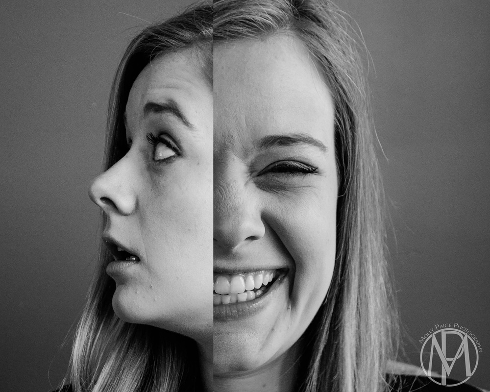
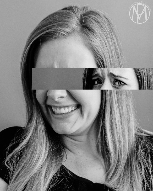
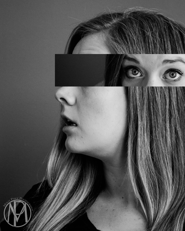
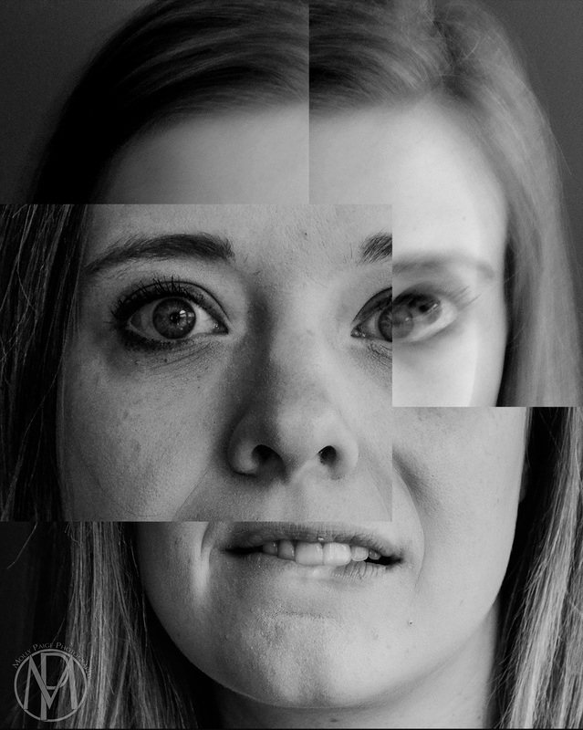
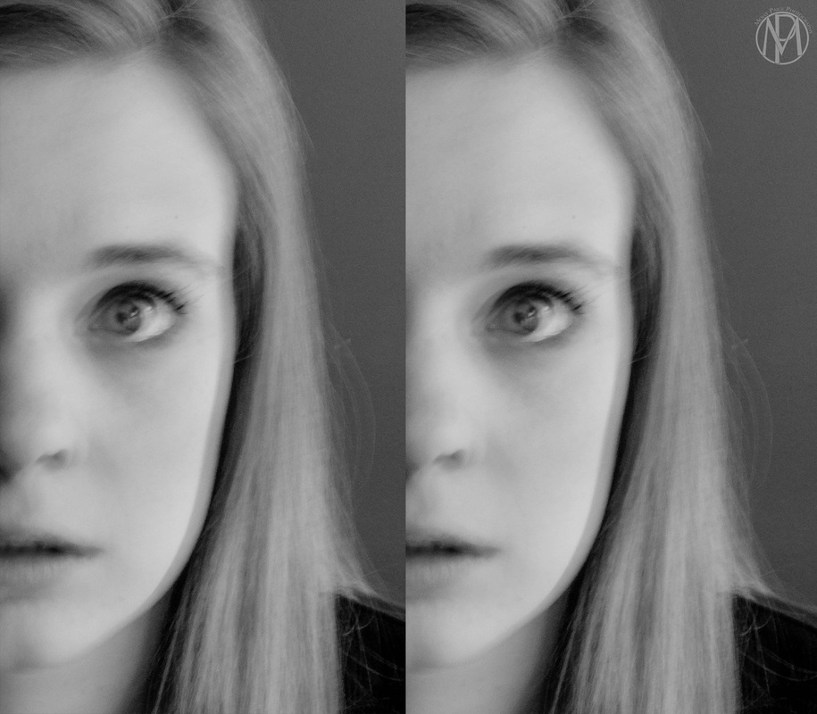
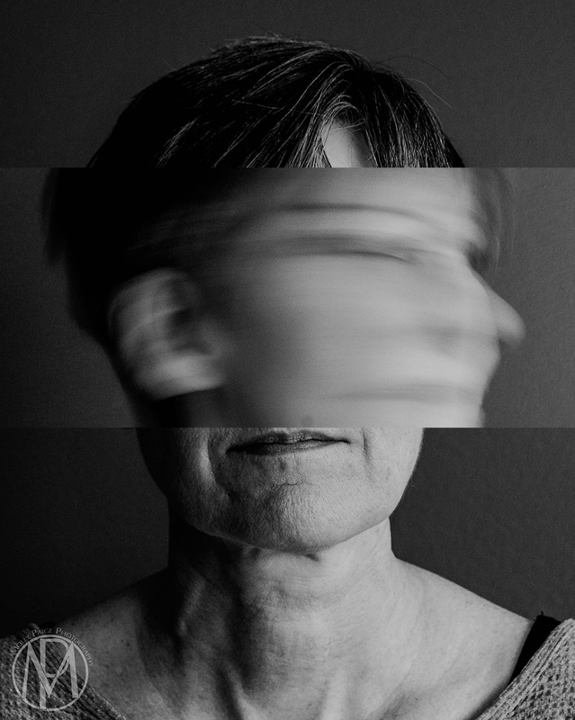
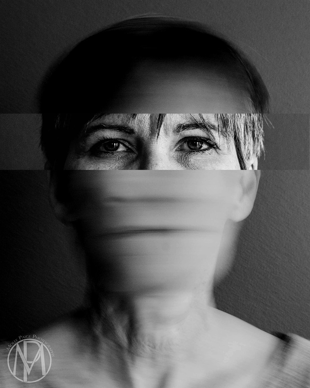
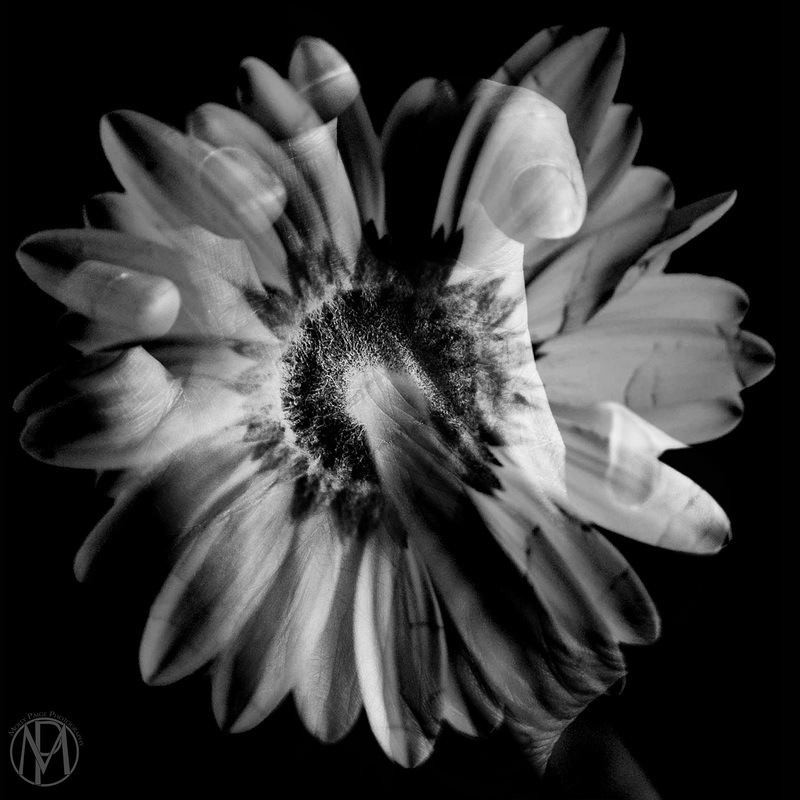
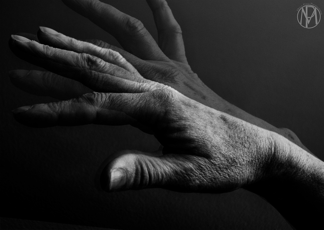
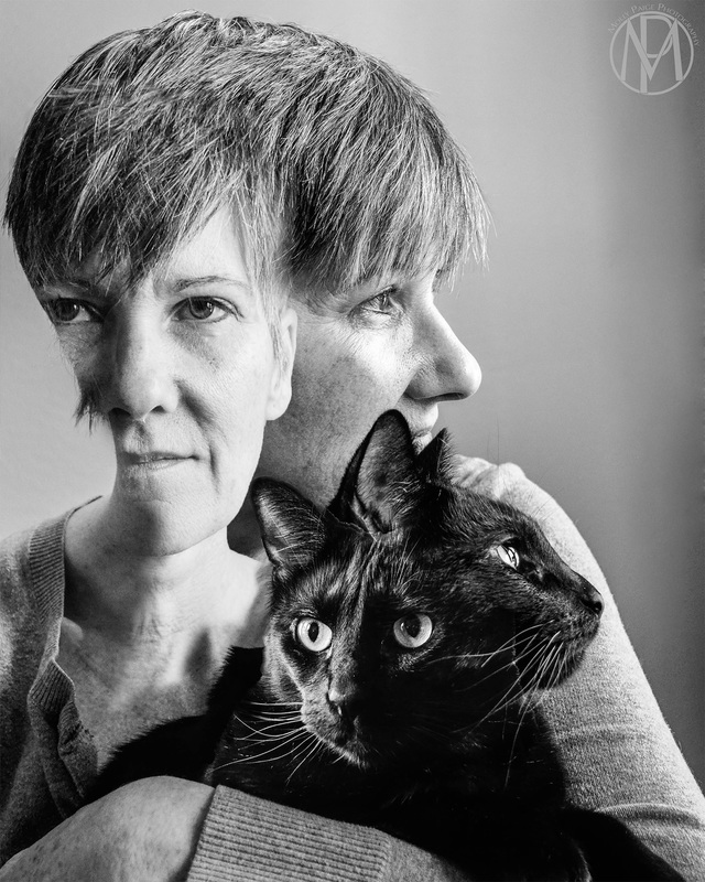
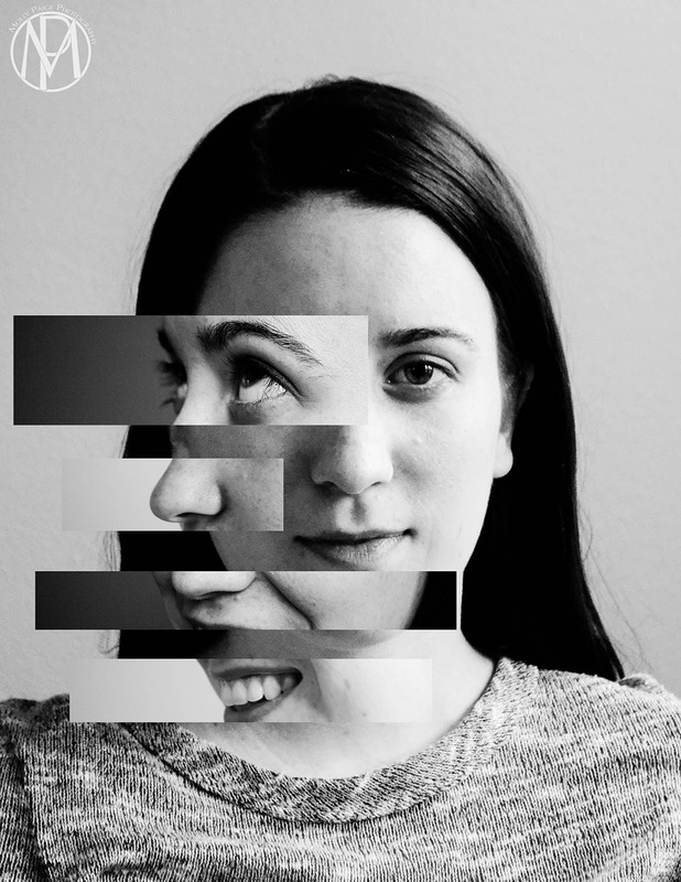
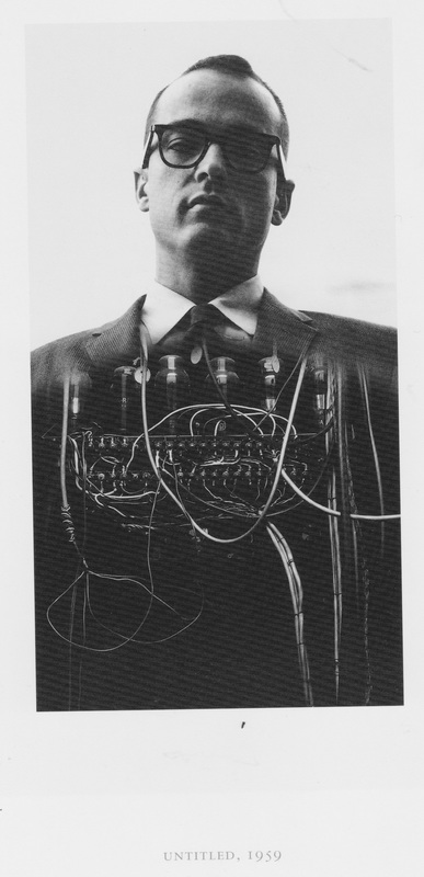
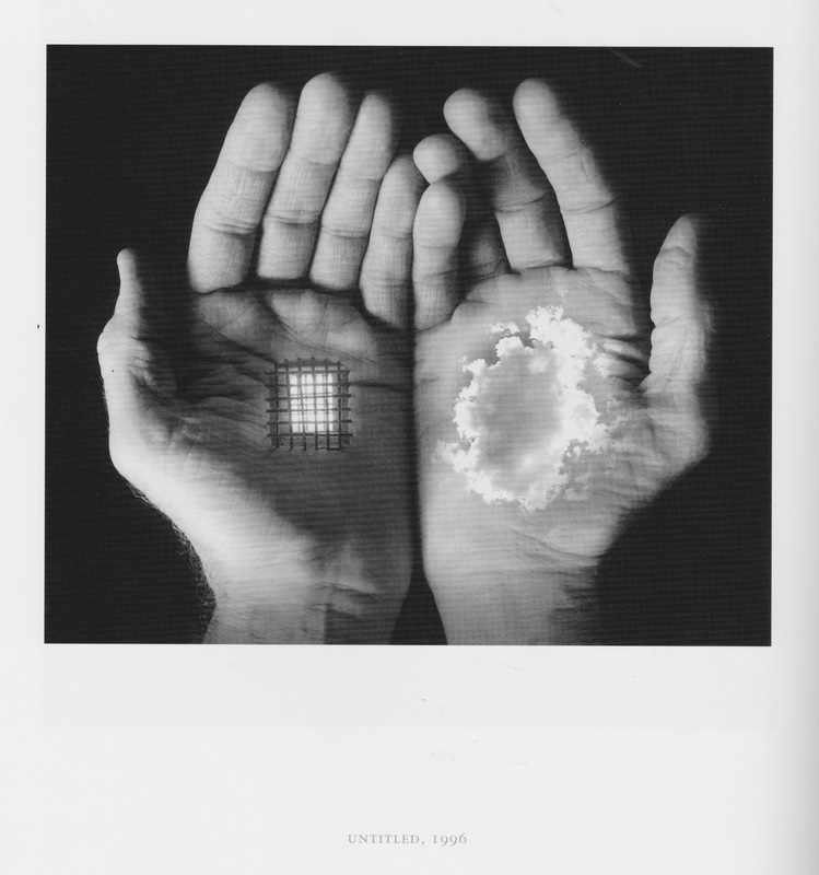
Since the last critique I have been working on my new idea, which is combining different emotions together into one photo. During my last critique I talked with Emi Gennis and she gave me some good feedback on how to go about this project. I have tried to piece together non stereotypical emotions. I have also tried zooming my camera in and out while I take the photo to show movement, which adds to the image and the emotions that I am trying to show. I also talked about this idea with Rhona McBain during our last Independent Study meeting and she mentioned that I should experiment more with the process that I am piecing the images together. I have tried a couple different ways to piece the images together that I haven't done. Before I would piece the images together in a horizontal way, where this time I tried use more vertical pieces. Which are the three shown below. I also tried to piece the images together by selecting certain parts from one photo using the magic wand tool and then piece it onto another image. This way is different than what I have been doing previously, but it was interesting to try different ways. These are the four photos below. It has been interesting trying the different ways to piece the images together, but I think I am going to go back to the "cubist" style I was working with at the beginning of this semester. I need to work with it a bit more with showing the different emotions, because I am finding it difficult to piece them together and still be able to show the emotions that I am wanting. I think that the more I work with the "cubist" style the better the images will turn out. These last couple photos are a ones that I have also experimented with piecing the images together. I am going to work with them a little more in the future. Artist Post - Gretchen BurnsI am doing my Artist Post over Gretchen Burns. I have talked with her recently about her work and she has narrowed her work down to a couple different ideas and is focusing just on them. Her "hobby" pieces are very detailed and go along with her scientific style of laying everything out. I also really like the butterflies that she has been working on. I agree with what Jamie Oliver said about them, where she should separate them each into their own piece. I think it would be interesting if she framed them in a shadow box and then mounted them onto the matte board with pins. It would almost be like they were real butterflies that she was collecting and pinning in a box. An artist that I would recommend to Gretchen would be Justin Landon. He does illustrations of various animals. His work is not as scientific as Gretchen's work, but it is an interesting style and a new way to look at illustrations. Here is the link to his website and some images. http://loveobjects.bigcartel.com/ 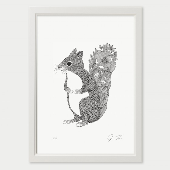 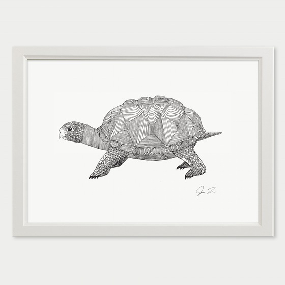 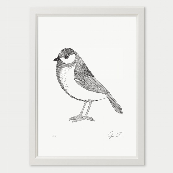 My concept has changed since the first critique. At the first critique I was focusing on comparing my sister and my mom in my photographs. Since then, I realized that trying to compare my mom and sister will be too difficult this semester, because my mom lives in Overland Park, KS and my sister lives in Arkansas. I don't get to see them on a regular basis, so I have decided to post pone this project. What I have decided to focus on is taking two emotions that are drastically different and combining them into one image using the cubist style that I have been working with. I did my one-on-one critique with Emi Gennis today and she suggested that I create a narrative for each image and bring out the emotions that way. With this I would be showing different emotions, other than the generic emotions, like happy, sad, angry, etc. The images that I've made for this critique are there to show the general idea of what I am wanting to do with the new project. The two images below are showing blurred movement. The first is showing what the woman is feeling on the inside, that everything is in motion and constantly moving, while she can keep her composure on the outside. That goes for the second image also, on the outside everything is constantly moving, but she can see through the craziness and constant motion. The next set of images are showing emotions that are similar to being happy and tense or cynical. These are showing the idea of what I am wanting to do, and I am going to recreate them, once I create more of a narrative for them. These are also showing different ways that I can arrange the images together to get my message across about the emotions being shown. When talking to Emi, she said that the last image in this set (Face #4), portrays the contradicting emotions with a story the best. There is a sense of submission with the base image and that the woman's voice has been muted or taken away. Also, the top image that is over the mouth is making direct eye contact with the viewer, which Emi said, makes it seem as though the viewer has something to do with why the woman cannot talk. Everyone is going to connect and see the images in a different way, but as long as I create a narrative of my own, there will be more to the images than just pairing two contradicting emotions together. This is what I am hoping to work on for the next critique. These last two images don't have anything to do with the my main project above. They are some images that I have been working on, on the side. The first photo is of the back side of a flower with a hand merged into it and the second image is of two hands combined together showing movement. When talking to Emi about these two photos, she stated that they don't tell a story or have any meaning to them, which I completely agree with. She gave me some ideas on how to change this. I could take the organic shapes that the hands create and make it into a geometric shape. She brought up the idea of combining the images to make something that is contradicting to them, which would be similar to my project above. Artist Post - Hannah CowardI really like what Hannah is working on for this semester. I find the connection between pharmaceutical and herbal remedies very interesting. I think that there is a lot that can be researched and created with this project and I can't wait to see what all she creates this semester. I think that it would be interesting if she made a prescription bottle out of the hand made paper. I think that it would tie the two different medical practices together.
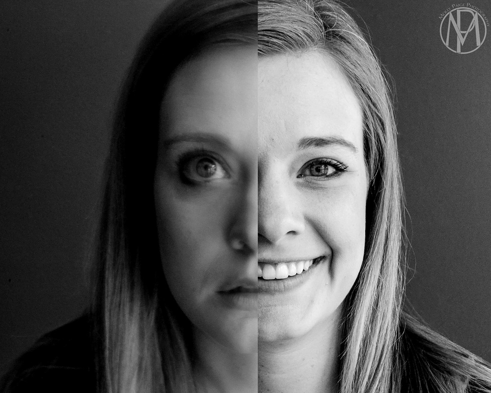
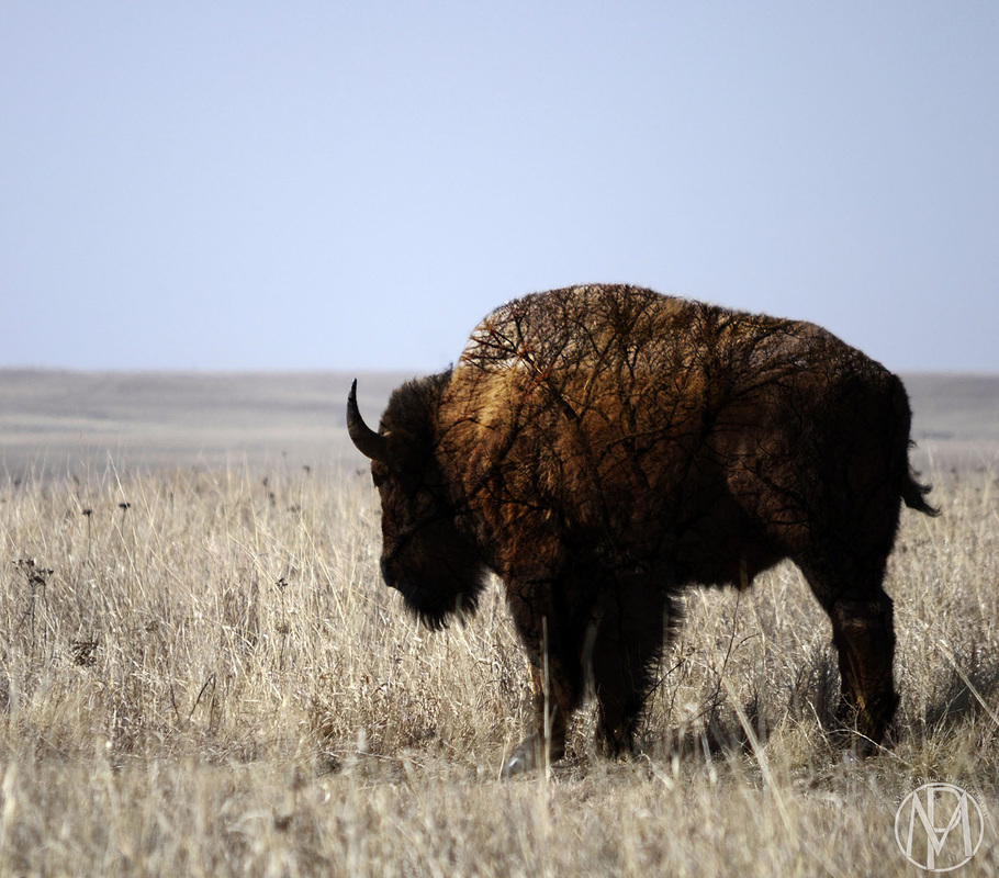
Here is a link to her blog: https://hannahcoward.wordpress.com/art-650-01-critique-iii/ Here are the photographs that I showed during the first critique on Friday, February 5th. Hello! I am a senior and will be graduating the fall of 2016. I am a 2-D General Art major with a minor in Photography. It's crazy to think that this is my last Studio Critique class, time really does fly by! My work is mainly about combing images together to create something new. I have recently come up with a new idea and concept with my photography and I am planning on spending this semester to expand on the idea. The new idea that I am going to be working with is inspired by cubism. I have researched many different ways that cubism can be done with photography and I came up with my own take on it. I want to show different perspectives within my photographs and hopefully later on movement. I got the idea while working on my final project in my Portrait Photography class last semester. I have barely touched the surface for this idea and I am planning on spending this semester working with it. I am also going to continue to merge images together while adding textures like I have done in past semesters. Below is the image that I made from last semester that is inspired by cubism. I have also included some of my past work as well. I have recently been inspired by Jerry Uelsmann and Sean Kernan. They both have a very unique style and work mainly in black and white. Uelsmann is know for merging and combining images together in a simple way. Kernan does this also, but in his own style of course. They can both keep their final images simple but convey a strong story with them at the same time. Here is a link to my final paper from Portfolio Creation (ART 450).
|
Archives
May 2016
Categories |
||

 RSS Feed
